![[Experimental]](figures/lifecycle-experimental.svg)
Usage
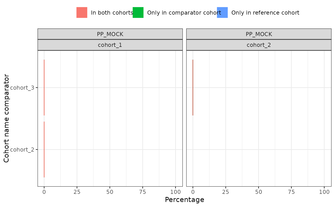
plotCohortOverlap(
  result,
  uniqueCombinations = TRUE,
  facet = c("cdm_name", "cohort_name_reference"),
  colour = "variable_name",
  style = NULL,
  .options = lifecycle::deprecated()
)
Arguments
- result
A summarised_result object.
- uniqueCombinations
Whether to restrict to unique reference and comparator comparisons.
- facet
Columns to facet by. See options with
availablePlotColumns(result). Formula is also allowed to specify rows and columns.- colour
Columns to color by. See options with
availablePlotColumns(result).- style
Visual theme to apply. Character, or
NULL. If a character, this may be either the name of a built-in style (seeplotStyle()), or a path to a.ymlfile that defines a custom style. If NULL, the function will use the explicit default style, unless a global style option is set (seesetGlobalPlotOptions()), or a _brand.yml file is present (in that order). Refer to the package vignette on styles to learn more.- .options
deprecated.
Examples
# \donttest{
library(CohortCharacteristics)

cdm <- mockCohortCharacteristics()

overlap <- summariseCohortOverlap(cdm$cohort2)

plotCohortOverlap(overlap, uniqueCombinations = FALSE)


# }
# }