![[Experimental]](figures/lifecycle-experimental.svg)
Usage
plotCohortCount(
  result,
  x = NULL,
  facet = c("cdm_name"),
  colour = NULL,
  style = NULL
)
Arguments
- result
A summarised_result object.
- x
Variables to use in x axis.
- facet
Columns to facet by. See options with
availablePlotColumns(result). Formula is also allowed to specify rows and columns.- colour
Columns to color by. See options with
availablePlotColumns(result).- style
Visual theme to apply. Character, or
NULL. If a character, this may be either the name of a built-in style (seeplotStyle()), or a path to a.ymlfile that defines a custom style. If NULL, the function will use the explicit default style, unless a global style option is set (seesetGlobalPlotOptions()), or a _brand.yml file is present (in that order). Refer to the package vignette on styles to learn more.
Examples
# \donttest{
library(CohortCharacteristics)
library(PatientProfiles)
library(dplyr, warn.conflicts = FALSE)
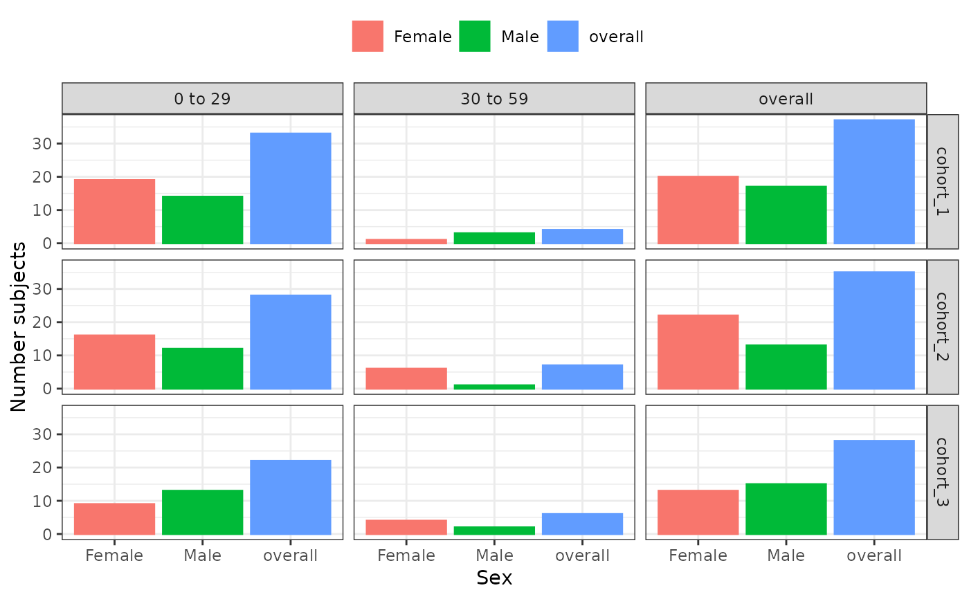
cdm <- mockCohortCharacteristics(numberIndividuals = 100)
counts <- cdm$cohort2 |>
addSex() |>
addAge(ageGroup = list(c(0, 29), c(30, 59), c(60, Inf))) |>
summariseCohortCount(strata = list("age_group", "sex", c("age_group", "sex"))) |>
filter(variable_name == "Number subjects")
#> ℹ summarising data
#> ℹ summarising cohort cohort_1
#> ℹ summarising cohort cohort_2
#> ℹ summarising cohort cohort_3
#> ✔ summariseCharacteristics finished!
counts |>
plotCohortCount(
x = "sex",
facet = cohort_name ~ age_group,
colour = "sex"
)
 # }
# }