Generate a plot visualisation (ggplot2) from the output of summariseIndication
Source:R/plots.R
plotIndication.RdGenerate a plot visualisation (ggplot2) from the output of summariseIndication
Usage
plotIndication(
  result,
  x = "variable_level",
  position = "stack",
  facet = cdm_name + cohort_name ~ window_name,
  colour = "variable_level",
  style = NULL
)
Arguments
- result
A summarised_result object.
- x
Variable to plot on x-axis
- position
Position of bars, can be either
dodgeorstack- facet
Columns to facet by. See options with
availablePlotColumns(result). Formula is also allowed to specify rows and columns.- colour
Columns to color by. See options with
availablePlotColumns(result).- style
Visual theme to apply. Character, or
NULL. If a character, this may be either the name of a built-in style (seeplotStyle()), or a path to a.ymlfile that defines a custom style. If NULL, the function will use the explicit default style, unless a global style option is set (seevisOmopResults::setGlobalPlotOptions()) or a_brand.ymlfile is present (in that order). Refer to the visOmopResults package vignette on styles to learn more.
Examples
# \donttest{
library(DrugUtilisation)
library(CDMConnector)
cdm <- mockDrugUtilisation(source = "duckdb")
indications <- list(headache = 378253, asthma = 317009)
cdm <- generateConceptCohortSet(cdm = cdm,
conceptSet = indications,
name = "indication_cohorts")
cdm <- generateIngredientCohortSet(cdm = cdm,
name = "drug_cohort",
ingredient = "acetaminophen")
#> ℹ Subsetting drug_exposure table
#> ℹ Checking whether any record needs to be dropped.
#> ℹ Collapsing overlaping records.
#> ℹ Collapsing records with gapEra = 1 days.
result <- cdm$drug_cohort |>
summariseIndication(
indicationCohortName = "indication_cohorts",
unknownIndicationTable = "condition_occurrence",
indicationWindow = list(c(-Inf, 0), c(-365, 0))
)
#> ℹ Intersect with indications table (indication_cohorts)
#> ℹ Summarising indications.
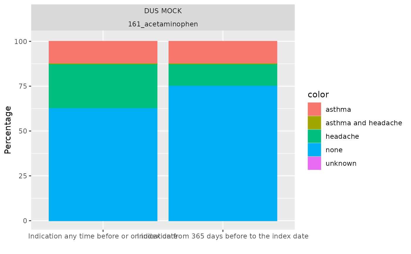
plotIndication(result)
 plotIndication(result, x = "window_name", facet = NULL)
 # }
# }